Neil Patel’s introduction of the author: When I think about branding, logo design, and designing great products, there’s one person I love working with. He has worked with me for many years and for several of my companies. His name is Ian Main, and this post—based on his latest work helping me rebrand Quick Sprout—is about Ian’s thoughts on how to create a great brand.
When I was growing up in Australia, my family would drive seven hours every Christmas holiday to visit my grandparents. There were five McDonald’s restaurants on that trip, and I knew exactly where each was and the distance between them. The sports teams I played for gave out McDonald’s gift vouchers, and McDonald’s sponsored our team equipment and ceremonies.
The colors, smells, sounds, and taste of McDonald’s all triggered delightful memories when I was young. The memories of my younger self enjoying simple things such as Happy Meals have stayed with me as an adult. I’ll always associate McDonald’s with those good feelings.
By now, you’re likely wondering how it’s possible to create a brand as memorable as McDonald’s…
Key ingredients to creating a memorable brand
After eight years, Quick Sprout rolled out a new logo on March 23, 2015, as part of an upcoming brand update to be unveiled throughout 2015. We want to share our process and what we learned, while giving you an inside look at where we want to take the Quick Sprout brand.
Understanding who your customers are and how they perceive your company is the most important part of creating a great brand. Both employees and customers develop positive or negative feelings toward a company based on how that company represents and conducts itself: the level of honesty and the degree to which it aligns itself with its own values and beliefs.
Is your brand reachable? Can customers think of your company as something tangible, personal, and real? If your brand acts and feels open, inviting, and human— just like you—you will be able to have a conversation with your customers the way friends do.
A logo is not a brand. Your work does not end when your logo receives approval. Establishing a brand is akin to the process of writing a design brief or researching key differentiators. Logos are just one more way to create a presence, a language, a connection – something that is universally understood and enjoyed.
You need four ingredients to create a successful brand:
- An understanding of your customers
- Friendliness towards your customers
- Honesty in how your company presents itself
- Depth beyond color and typography
Impact people’s lives. Get them to slow down by forming a personal connection. Remember, it’s about them, not you. Give them enjoyment, a belief, and trust in what you do and a reason to make themselves better at what they do. This creates experiences, which, in turn, create memories.
Mistakes to avoid when creating a brand
Think back to brands from the 60s. How did they manage to stand the test of time? You should strive to create a brand that people want to stick on their car bumper or tattoo on their bodies!
“Your brand is what people say about you when you’re not in the room.” – Jeff Bezos, Founder of Amazon
Make sure you ask the right questions about your company and your customers. Your goal is to align the company message, beliefs, and values with the brand identity that you create. This will help you avoid generating the wrong tone or emotion and ensure that your company’s image is upheld.
When you work with people who have done branding for some time, you’ll often get 2 – 3 concepts delivered to you so you can give feedback. The reason for this is that it minimizes the emphasis on any single approach and allows you to give feedback early and often in the process.
Websites like 99designs that allow you to submit a request and get many options can be helpful as part of this process. When using these sites, make sure you provide enough information about your company upfront before you start working on creating your brand.
Picking colors for your brand
The answers to questions about your company will help you make the best color choices. Knowing what colors are used in your industry, including by your competitors, is a great way to start the process.
Your logo rationale and future brand guidelines should document color choices, their meanings, and best practices.
Know that colors can represent different emotions, feelings, and memories. When researching colors, I recommend you check out these 2 reports:
Symbols. A common trend.
Logos can be categorized as these three types:
- Symbol/Logomark
- Logotype/Wordmark
- Combination Marks
More recently, there’s been a trend with logos and brand identities to represent the brand by a symbol on its own. While this movement is currently growing on the web, the car manufacturing industry has already been using this approach for quite some time. Car manufacturers choose to display their iconic symbols as badges of honor on the front and rear of cars while reserving the logotype for more official purposes such as paperwork or manuals you find in the glove compartment.
When we think of symbols as logos, Apple is one company that immediately comes to mind. Symbols are designed to be unique, to evoke recognition, and to be presented in a way that allows for a broader interpretation that appeals to our emotions and memories.
A lot of symbols we see today evolved to their current form over the course of years or even decades. Apple, Starbucks, and Twitter are great examples of how a symbol as a logo can become just as—if not more—recognizable as a logotype or combination.

Determining what works best for you will depend on certain factors such as industry type, target audience, company message, beliefs, and tone.
Combination marks—where the symbol and logotype appear together—offer versatility. This option allows for a foolproof plan if you decide your brand is memorable and recognizable enough to deliver only the symbol of your logo. It also allows you to split the symbol from the logotype and use each piece separately for specific occasions to help improve the flexibility of your brand.
A real life example
The logo was just one part of my strategic look at how Quick Sprout has evolved since Neil first started it in 2007.
I sat down with Neil to get an understanding of what beliefs Quick Sprout holds, what Quick Sprout promises as a brand to its customers, and how the brand is perceived. These questions helped structure a design brief that gave us an insight into the brand and helped us make well-founded decisions about every aspect of the branding process, including creating the logo.
The design brief is the centerpiece of the design process. It will help you see patterns about the company that may not be instantly obvious. It is a great way to see key differentiators that make a company unique.
Several statements seemed to reflect Quick Sprout the best, helping me see a theme. When I asked about the history of Quick Sprout’s name, I received this inspiring response: “The ethos of the name comes from the fact that big things start small and you have to tend to them if you want them to grow – or they’ll die.”
Here are a few more:
- “We’re a brand that educates people on how to do modern marketing.”
- “To help people get better and become smarter with their marketing.”
- “It’s really about giving your audience what they want by helping them improve their lives, both personally and professionally.”
- “We’re not just about improving business results – we’re also about making someone smarter and better at their jobs so they can further their careers.”
- “We want to help people be on the forefront of their industries and do better than their competitors.”
- “Everyone’s a marketer; they just don’t know it yet.”
Quick Sprout’s beliefs and values are focused around helping others and nurturing people to inspire both personal and company growth. These findings validated the current branding: shades of green and leaves represented growth and openness.
Research
One simple technique to help discover what a company is all about is to mind map the keywords that come out of conversations with stakeholders.
I created two mind maps: one for the word “Quick” and one for the word “Sprout.” This helped visualize any word association that might be useful later on.


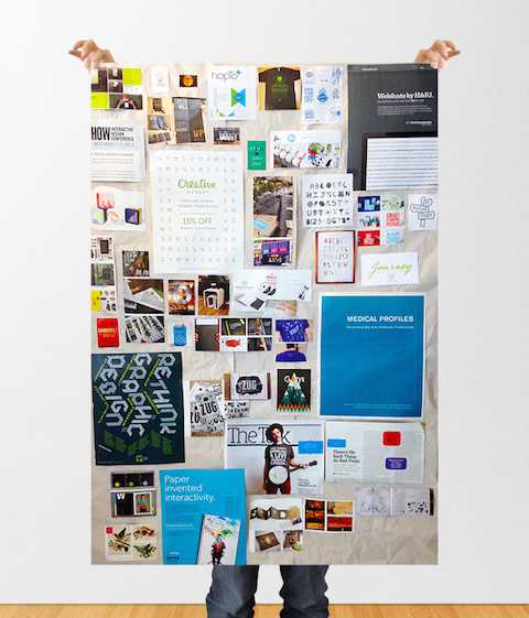
Mood boarding helped frame everything that had been collected into one place so I could take a step back and take it all in.
I don’t always create a physical mood board. In the case of brand work, however, stepping away from the computer can give you a unique, deep, and meditative look at this process. Collecting graphics, shapes, colors, type, and textures lets you see, touch, move, and organize a collection of possible patterns very quickly and with little criticism or objection.


Sketching
In a similar fashion, the ability to collect visual ideas in a rapid and deliberately non-polished process loosens up any preconceived notions of what the logo should look like. You may have a biased or old idea that you want to start exploring; this is fine as long as you don’t spend too much time on a single idea. Now is a perfect time to get any and all thoughts down on paper quickly.
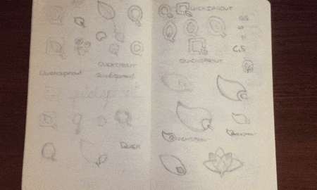
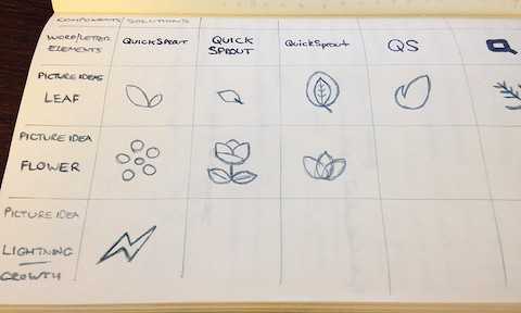
Another helpful process when sketching is to use a morphological matrix to generate ideas that may not have come to you naturally without a systematic approach.
Formalizing
By now, several solid ideas should be emerging. Are you leaning towards a certain sketch? What’s attracting your eye and pulling your attention continually?
Before going any further, it’s a good idea to cross-reference your concept with all the research you’ve done.
Does it align with what has been said in the design brief? Does it push the company message forward in a powerful way? Does it evoke a positive feeling? Is it memorable?
Once you move into the formalizing stage of your concept, the process can slow down drastically; asking above questions early and often will help the process continue to move forward in the right direction.
It’s extremely important to test the logo concept in a wide range of scenarios. After all this work, you need to make sure the logo shows well in different designs in perfect harmony with color and whitespace.
What’s more important is for the logo to maintain the brand promises and company beliefs at any resolution and at any size, whether it’s an avatar in a mobile app or an image found on Google Images when someone searches for “Quick Sprout logo.”
![]()
Polishing
Here’s the fun stage. Start playing around with and iterating colors, typography, and arrangement. Your research should give you clues about making these decisions. Are there specific colors that evoke feelings or memories that can be closely associated with the company?
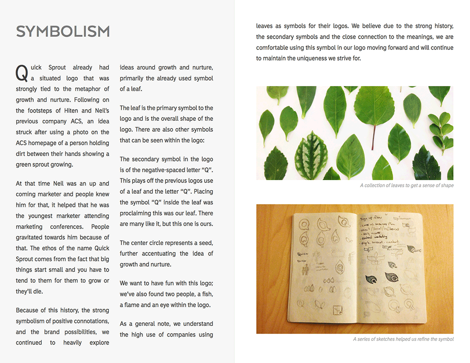
Quick Sprout already uses green as a primary color throughout the logo and brand. Dozens of words were found during the mind-mapping research that directly related to the connotations of the color green.
Building from that, I explored many types of green, but I was drawn to those found in nature.
Because Neil publishes marketing content regularly, my goal was to find a green that felt calm and soothing. This color needed to create a mood that would help readers relax and enjoy Quick Sprout.

Delivering
All of that research, preparation, and deep thought now gives you a complete package to present to your team. This is an exciting, emotional part of the process for everyone, including your customers.
Creating a logo rationale helps explain specific points in your process and the decisions that were made. The rationale guides the presentation, keeps it focused, and assists with questions or concerns. You should have a rationale for every concept you present.
Presenting the new Quick Sprout to you!

The logo you see here is the result of the above process. Quick Sprout now has a clear direction where to take the brand in 2015 and beyond. Over the coming months, continue to watch Quick Sprout evolve into something we think you’ll love.
This is all possible even with a small budget!
The Nike swoosh logo is an amazing story of how the logo was purchased for $35 from a college student – Carolyn Davidson. Carolyn was hired by Phil Knight at $2 an hour in 1971 to come up with design concepts for his new company. Aside from the fact that Carolyn might have undercharged for her services (she was later compensated), her decision to keep the logo simple allowed the brand to grow and adapt around it. This is likely a key reason why we are so familiar with Nike’s logo and brand.
If you are on a budget, you need to be thorough with your research. Answering all the questions in the design brief should give you enough direction to start conceptualizing solid ideas.
We’ve provided you with a free design brief template that you can fill out and give to your designer or post on 99designs as part of your design request.
Conclusion
Creating a memorable brand isn’t easy, but if you follow the process above, you should do well. Just keep in mind that spending more money on branding doesn’t necessarily yield the results you are looking for. It’s best to put in the effort upfront to ensure that your brand reflects your company’s core values.
Find this article helpful?
This is just a small sample! Register to unlock our in-depth courses, hundreds of video courses, and a library of playbooks and articles to grow your startup fast. Let us Let us show you!
Submission confirms agreement to our Terms of Service and Privacy Policy.
Already a member? Login
No comments yet.
Start a Membership to join the discussion.
Already a member? Login